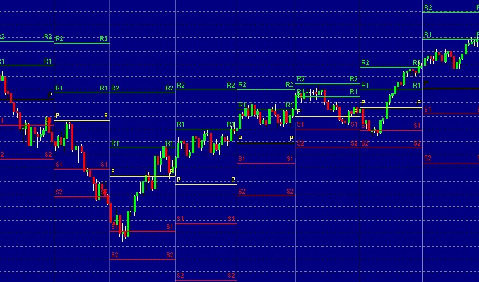
The hockey stick line chart
In technical analysis, there are different kinds of charts and graphs. Under the line charts, we have what we call the “hockey stick chart.” It is a line chart of prices with a sudden and sharp increase after relative stability. Now, we are all curious why this line chart is called a hockey stick. It is because the line that connects the data points looks like one. It is pretty interesting, right? In business, economics, and policy, the hockey stick is famous as a reference. It gives us visual representations and ideas about extreme shifts and dramatic growth. For instance, these dramatic growths and changes are relative to corporate earnings, worldwide temperatures, and poverty statistics.
The composition of the hockey stick line chart
Blade. Small curve. Long shaft. These are the elements that make up a hockey stick line chart. And just like any other chart, it displays data with the y-axis over the x-axis. The Y-axis is the low-level activity, and the X-axis is the short period. It will show a sudden bend that indicates the inflection point. Finally, you will also see a straight and long rise that comes with a steep angle.
Where will we usually see this chart?
The people who usually encounter the hockey stick chart are the ones who are in the environmental studies and medical field. This chart is most helpful and observed in science laboratories. Aside from the people we mentioned, many social scientists also use the chart. Many scientists plot global warming data on hockey stick pattern charts. The hockey stick also delineates many observations about poverty rate, thus mentioning social scientists involving this chart.
The attention that the chart gets
The things that a hockey stick chart can strike people and need to pay attention to. If there is a sudden and extreme direction change of data points from a continuous flat period that the hockey stick chart shows, people need to do something about the situation. They need to know the root cause and the factors that contributed to what is happening. If the data change occurs suddenly, entities should understand whether the change is an aberration or something that represents a fundamental change.
Let us cite an example.
Let us say that Company A is a fast-growing company, and it reached its sales goal faster than its anticipated timeline. Company A was expecting to reach $1 billion in sales in at least four years, and they were able to achieve this in just three years. Hence, we consider it as a fast-growing company. So, if we look at the $150K sales in 2017 compared to the $10 million revenues in 2018, we can say that this is the hockey stick line chart’s blade part. In 2019, Company A reported its total sales, which is $200 million in total. This part represents the upward bend, also known as the hockey stick chart’s inflection point. Let us fast forward to 2021. Company A reports skyrocketing $1 billion sales.
Numbers can be deceiving.
We can put this data on a graph where Company A’s sales will go to the Y-axis and the time on the x-axis. If we do, we will see a hockey stick pattern. Now, we see that sales are skyrocketing. However, it does not always mean that the company is seeing profits. Sometimes, net losses hide behind high revenues and sales because of sales and marketing expenses.

